Designing a New Look for a Classic Game

Merging the legacy of Jeopardy! with the casual word-puzzle market.

Challenge

Jeopardy Words was a prototype spin-off of the mobile game Jeopardy! World Tour (JWT), combining the familiar brand of Jeopardy! with the highly popular crossword-puzzle market. We wanted to test if traditional trivia gameplay could be turned into a more casual word puzzle that would be fun and appealing to more players.

The goal was to create a visual identity that stayed true to the brand while distinguishing itself from the TV show.

Sector
Mobile Games
My Role
UI, Visual Design
Timeline
3 months

Gathering Insights

Background

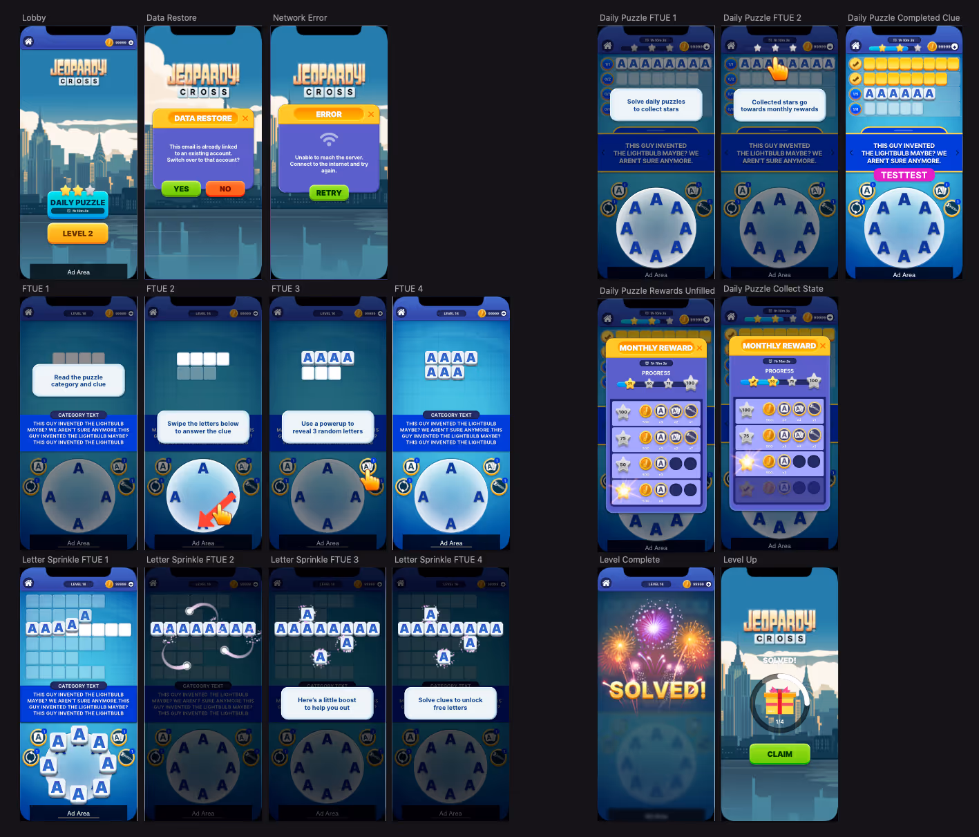
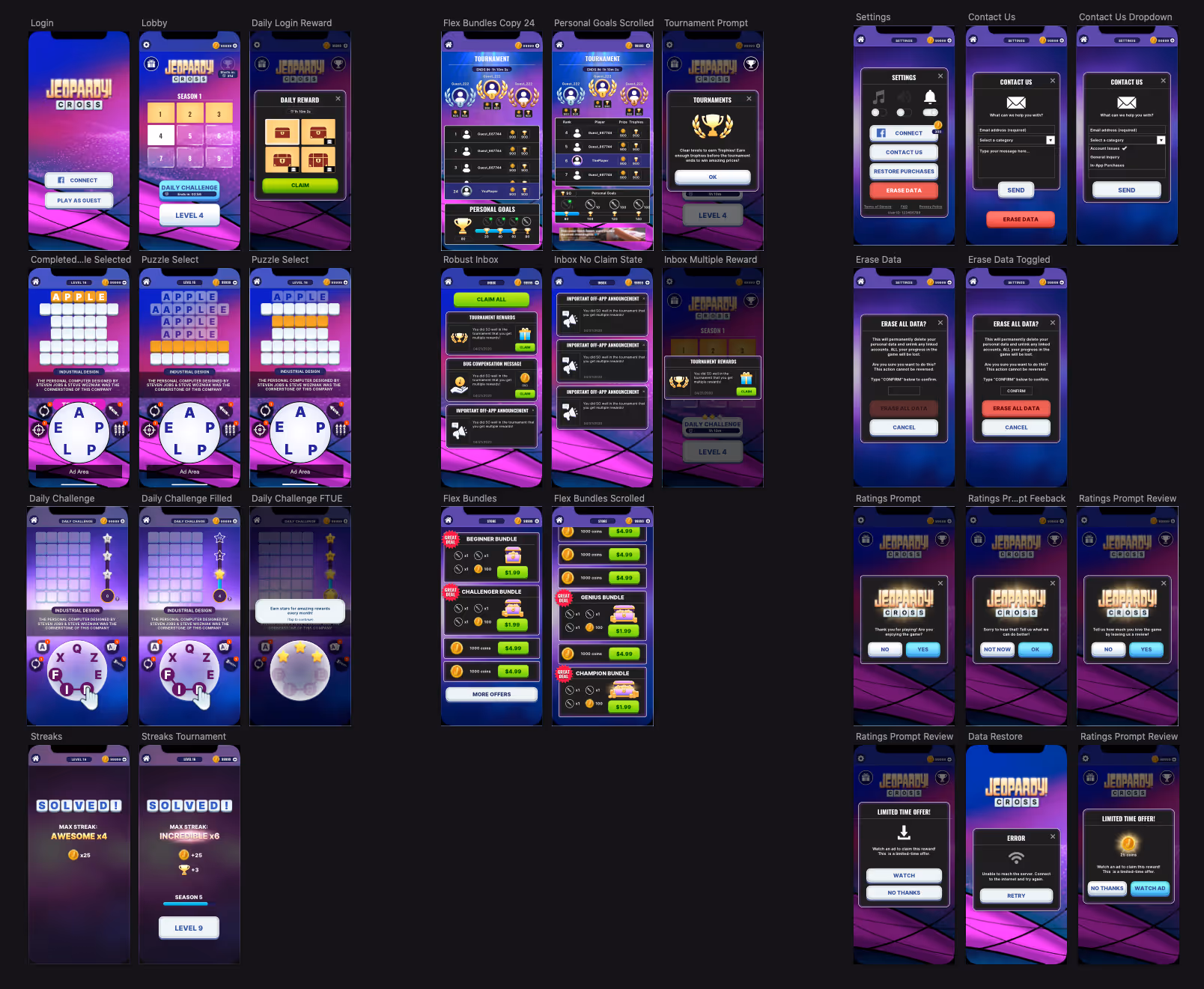
My role was to establish the overall look and feel of the prototype. I developed different visual styles for the UI and core screens and motion mocks that guided developers during implementation in Unity. I also worked directly in the game engine to implement 2D art assets and test how the design looked and responded during real gameplay.

This prototype phase was an experiment  to see which design and gameplay ideas had the most potential to move forward.

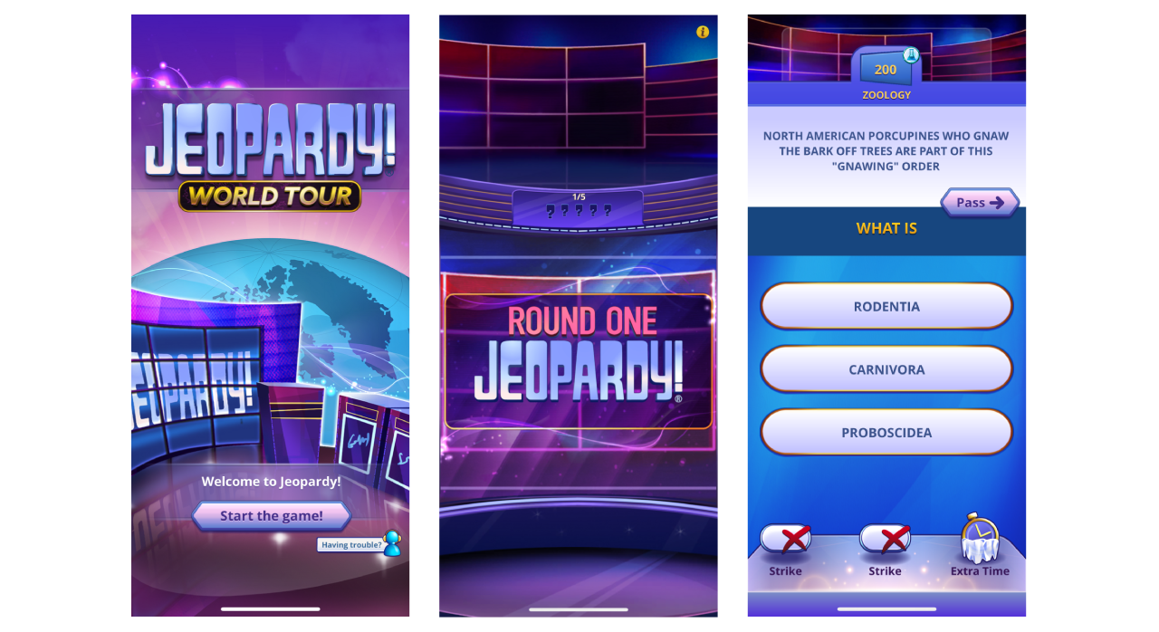
Jeopardy World Tour was one of the studio's most popular titles.

Competitor Analysis

I looked at leading competitors in the market to see which visual styles worked well and to identify opportunities for JW stand out.

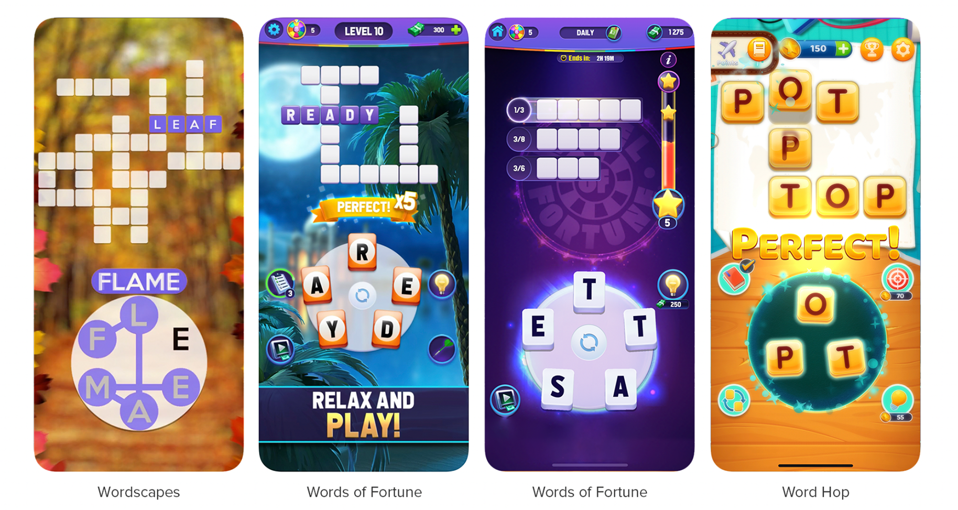
Common themes I found:

Bright saturated colour palettes.

Flashy animations and particle effects to highlight key moments (e.g., clearing a level).

Thematic backgrounds reinforce progression through levels.

Audio cues paired with animations give players satisfying feedback and a sense of reward.

We decided to swap out the crossword-style layout for a more traditional grid format to better align with the Jeopardy! brand and also took advantage of backend structures already in place from JWT.

Wireframes handed off to me for visual exploration.

VISUAL Exploration

UI Design

I leaned into two themes; one that stayed closer to Jeopardy!’s traditional blue, and another that is more abstract. Below are my explorations:

Theme 1: Exploring the traditional Jeopardy! blue paired with a city theme to guide level progression.

Theme 2: Exploring a stage-set concept with bold purple colours.

Motion Mocks

At this stage, I created motion mocks to explore how key features could behave. These mocks helped us visualize interactions early on and I worked closely with developers to understand what would be feasible to implement in Unity.

Daily Challenge - First Time User Experience

Daily Challenge

Level Up Transition

Daily Double - First Time User Experience

Unity testing

I worked directly in the Unity engine to test new designs and adjust existing visuals. This allowed me to see how the assets performed in real gameplay. It also gave me the chance to build skills in Unity and learn the Git workflow.

Flow 1

Flow 2

Conclusion

Next Steps

Through this exercise, we created a proof of concept that stayed true to the Jeopardy! brand while also standing on its own.

After establishing the core visual direction and gameplay, the project was handed off to the brand owner for further development and potential production.