The hospital's intranet CMS was outdated with a cluttered interface that made it difficult for editors to manage content confidently. A lack of formal training led to inconsistent updates across department pages, which impacted clinical and frontline staff seeking reliable information.
Our goal was to upgrade the CMS and design a more intuitive experience so editors feel equipped to maintain their pages.
The hospital intrane is a hub for staff and clinicians to access employee resources—department information, news, directories, and other tools. Many clinical staff rely on it for everyday tasks, so it's important that information is up-to-date.
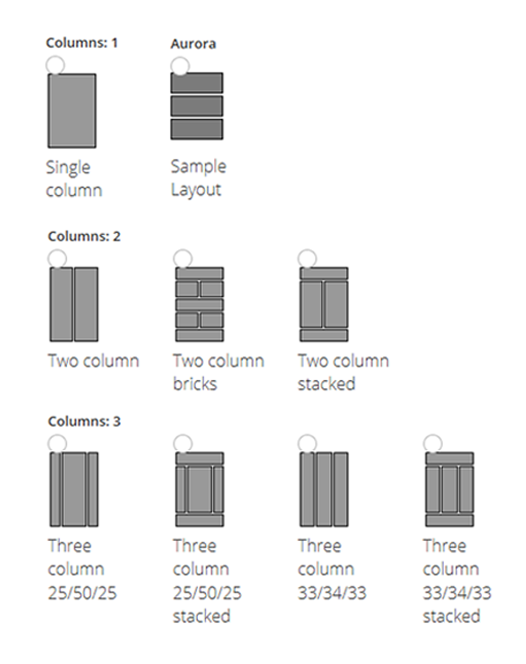
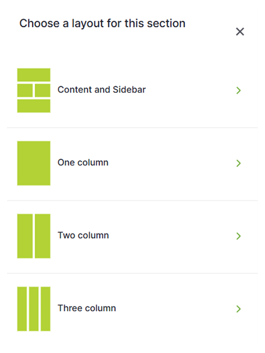
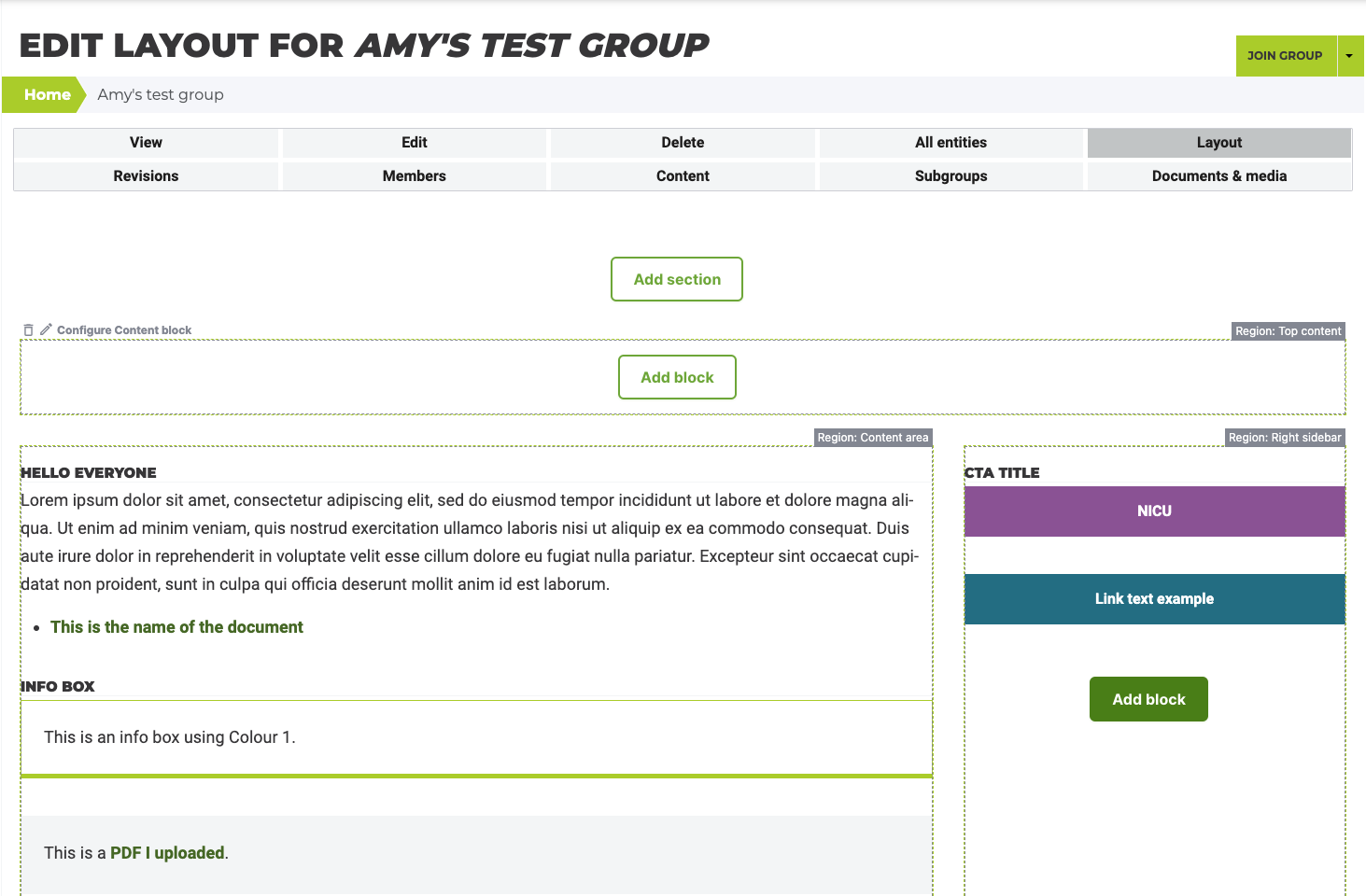
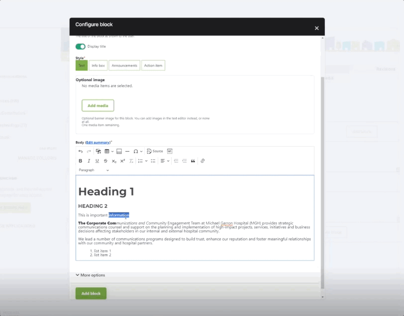
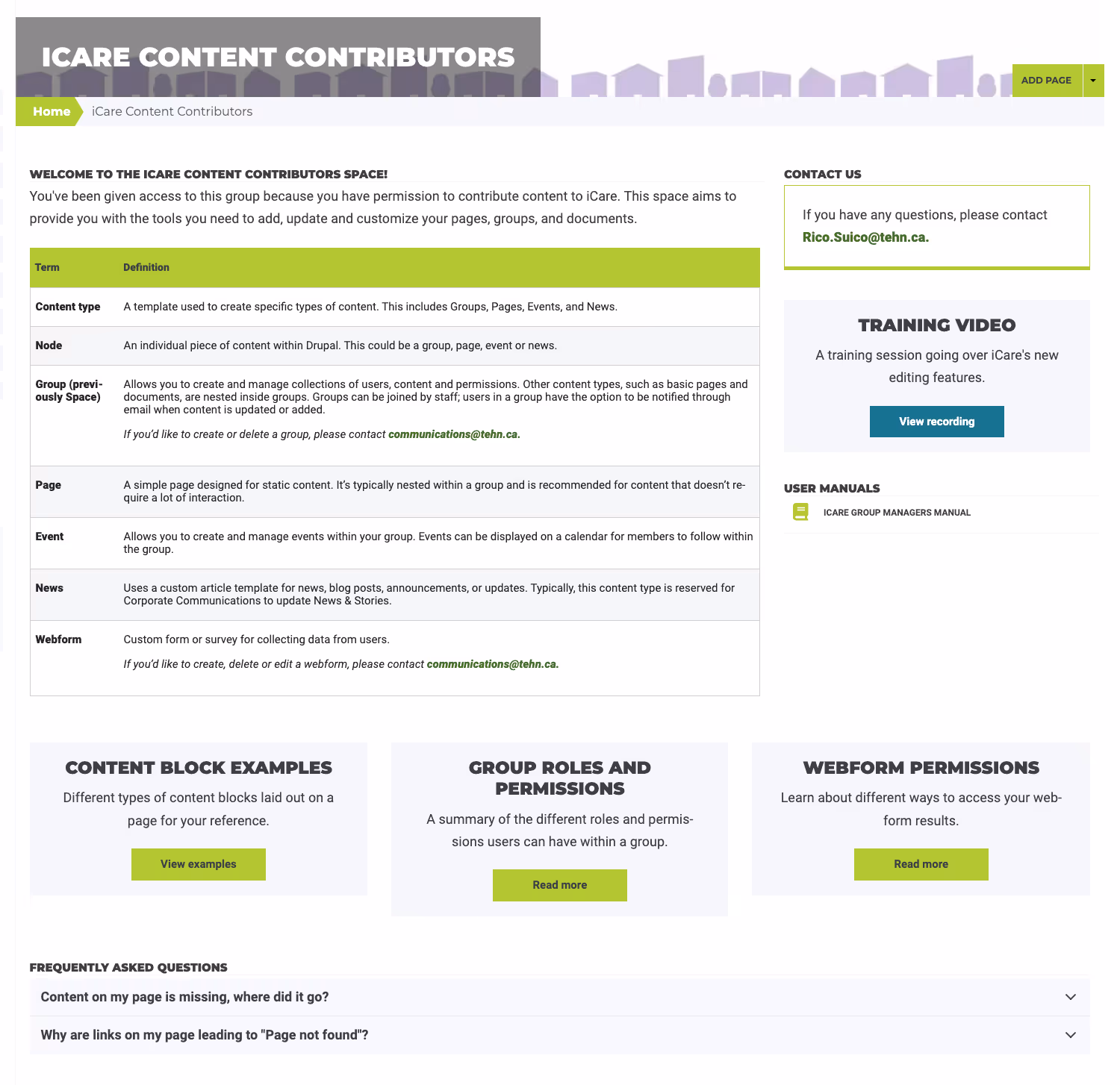
Teams maintain their department pages using the CMS layout builder, with the guidance of the Communications team.
When I joined the project, there was no formal process to train new editors. Updates were often treated as low-priority and ownership was unclear. Our goal was to shift this mindset by formalizing training and simplifying workflows to empower and motivate staff to make updates. This would lead to more consistent publishing and ensure frontline staff could rely on accurate information.
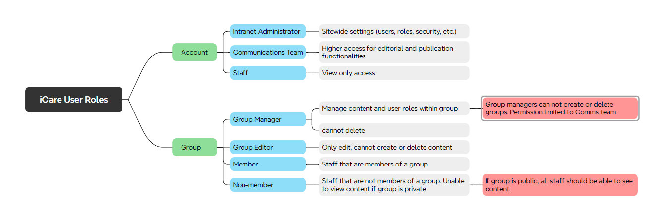
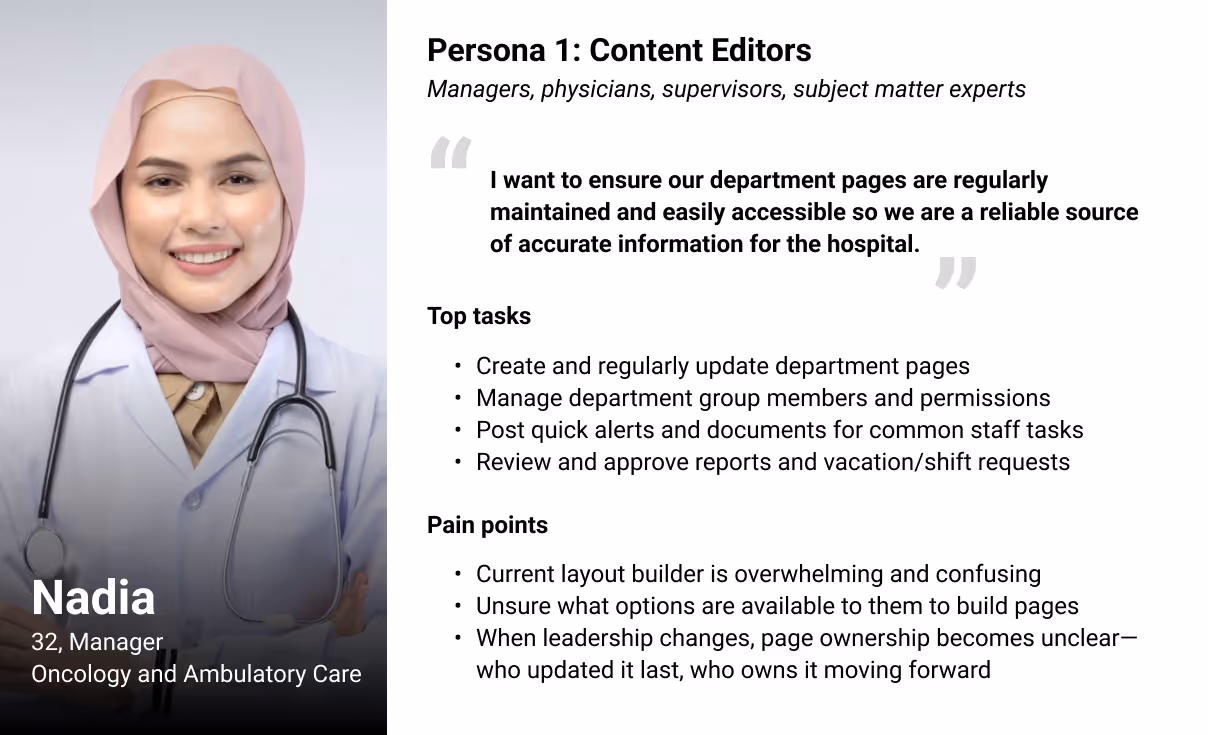
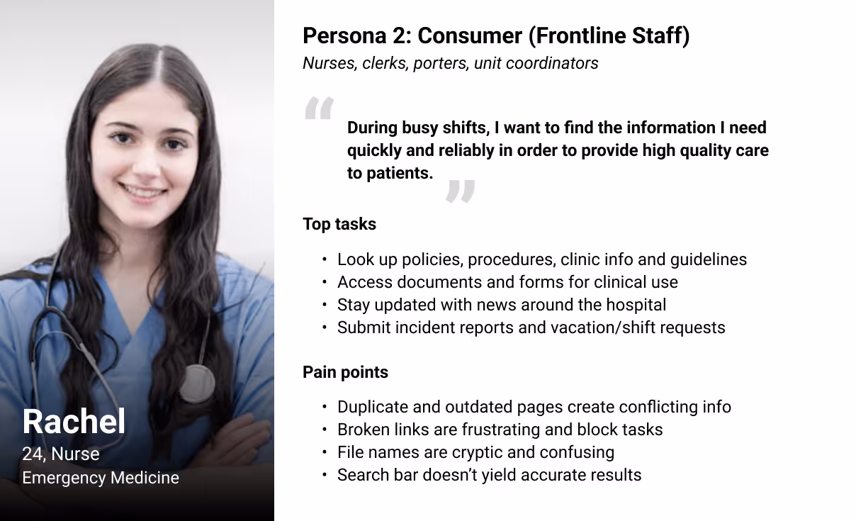
I met with department leads to understand their team's priorities and pain points. We recognized two key groups that rely on the site for everyday tasks.
Learnings
Content editors feel overwhelmed by the layout builder and default to the few steps they know. This results a frustrating editing experience and discourages them from spending more time to learn the platform. For time-pressed hospital staff, fewer options and templates work better than a long list of technical blocks.
Frontline staff need information quickly and reliably. When labels are vague or pages feel out of date, they default to calls and other workarounds to get the info they need. UI improvements must be paired with editor best-practices training to support consistency across all content.
To understand how content is being organized, I audited the site to see which Drupal modules and blocks were being used. We kept the popular entities through the migration and phased out the underused to simplify options and reduce choice overload. We reduced the options to the following:
Modules
Content Blocks for layout builder
Content built using phased out entities were repurposed into the selected modules and content blocks.
We streamlined the available page templates to align with how editors were structuring content; most pages already followed a similar pattern. This improves consistency and cohesion across different departments.
Old template options
New template options
We established new roles to shift publishing authority from the Communications team to department leaders—giving them more autonomy to keep their pages up-to-date.
This independent model reduces bottlenecks, especially during leadership changes where the Communications team is not directly involved.
Mapping out user role permissions and definitions.
In our dev environment, I tested the simplified layout builder with four content editors from high-profile departments. I asked them to complete the following tasks:
"Create a new department subpage using the standard template."
"Build a two-column layout, placing overview text on the left and quick links on the right."
"Create staff directory cards for two or more team members in a table."
"Upload a PDF policy document to the media library and link it on the page."
"Assign a staff member as content editor."
Based on feedback, we renamed two content blocks for clarity and reordered the menu to place the most frequently used items at the top instead of sorting alphabetically.
Some editors requested niche content blocks tailored to very specific departmental needs. We decided to treat these as one-off solutions with custom code to avoid cluttering the menu.
Layout builder menu and interface.
After launching the upgraded intranet and new editor workflow, I hosted two online training sessions broadcast across the hospital. These sessions provided editors and staff with:
Highlight key changes to the new intranet and available features.
Walkthrough of the new layout builder.
Q&A to address questions and concerns.
To extend support beyond the live sessions, I created a dedicated resource group with definitions, step-by-step manuals, and content templates to guide new editors.
Creating this hub also reduced the volume of inquiries to the Communications team, freeing up time to focus on capital projects.
Resource hub for content editors.
Feedback was that the builder was much easier to use, with many editors, existing and new, reaching out with questions and requesting permissions. The increased engagement signalled a renewed excitement for updating pages, helping keep the site more reliable and up to date. This momentum continued months after launch, supported by regular touchpoints with editors for sustainability.
With more regular updates to pages across the intranet, there have been less inquiries around inaccurate and outdated information from general staff.
What I learned:
Leveraging existing patterns from the old workflow reduced the learning curve and helped ease the transition.
Less choice builds confidence, especially for hospital staff who may not be tech-savvy. Simplifying the component sets and streamlining options gave editors clarity and made them more willing to publish.
Good UX goes beyond the interface. It also means providing best practices, formal training and guidance so editors feel equipped to make updates with confidence.